BOB HUOT RECENT PAINTINGS
Bob Huot’s work from the 1990’s reflects the artist’s abiding fascination with the nature of painting. Initially these impressive canvases – like Bob – seem big, exuberant, aggressive, sometimes playful, overwhelming, and emotional. But, as one considers the artist and his paintings more carefully, however, it becomes clear that there is a strong dose of self-knowledge and intellectualism that governs these seemingly expressionist outpourings.

Huot had, of course, been one of several artists in the mid-to-late 1960s in whose hands the art object dematerialized.¹ In retrospect, he reflects with irony that the quest for dematerialization led him back to the object, but the traditional western painting format of the rectangle no longer satisfied him. Noting that shaped paintings have existed in western art since at least medieval altarpieces, Huot was aware of the fact that he did not want to choose a new format that was arbitrary or gratuitously novel. After reading R. Buckminster Fuller in the 1960s, Bob grew increasingly interested in the possibilities of the equilateral triangle, which he used more and more frequently in the mid-to-late 1970s in the Truss and Decoration series. He wanted to break from the rectangle’s window/mirror implications as well as (perhaps even more importantly) from its associations with industrialization – the representative unit of pre-fabricated materials and compartmentalization. The triangle, by contrast, enables Bob to project what he describes as “a whole other geometry” that signals the potential for a different universe. Huot admires the physical strength of the equilateral triangle because it creates something much greater in structural strength than a rectangle. For this founding member of the Art Workers’ Coalition, replacing assembly line symbolism for that of cooperative experience was undeniably potent.
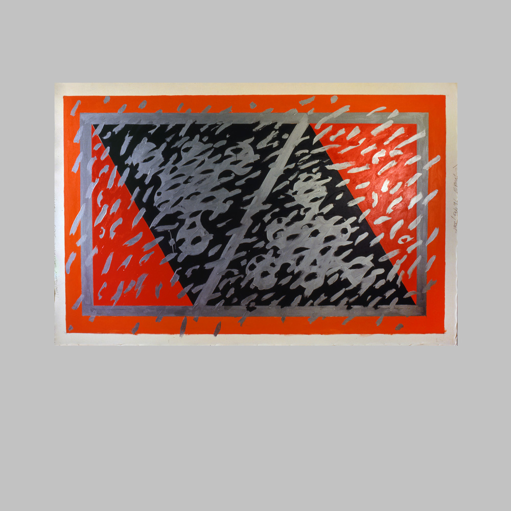
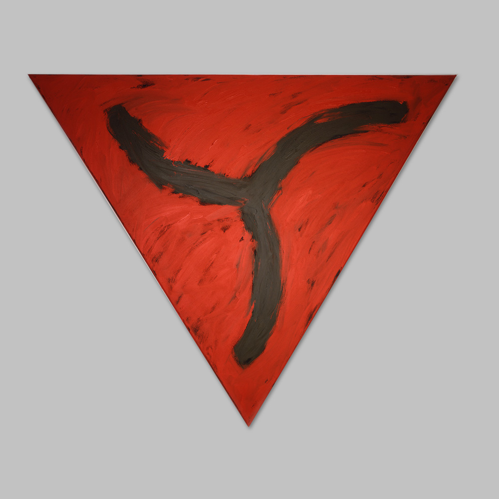
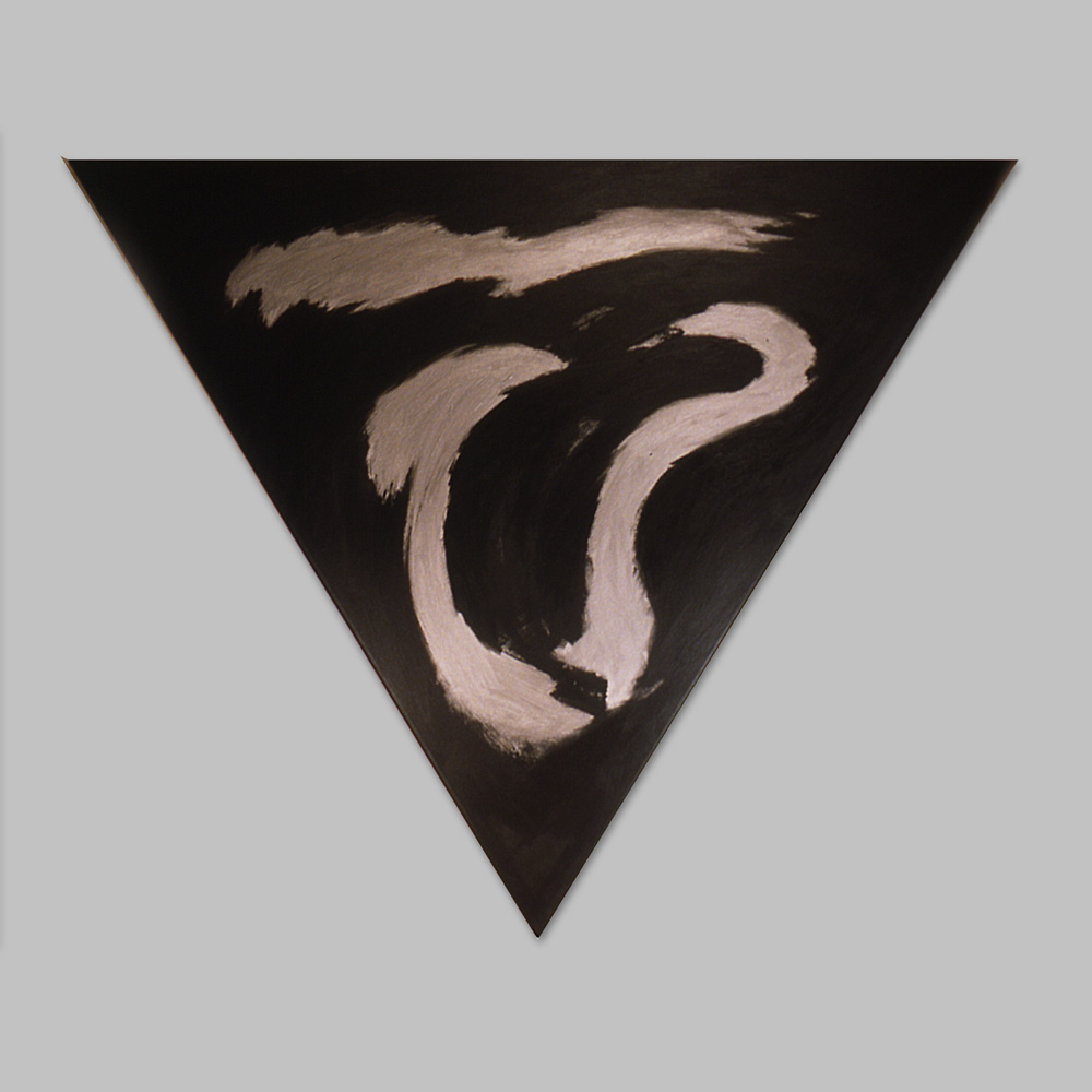
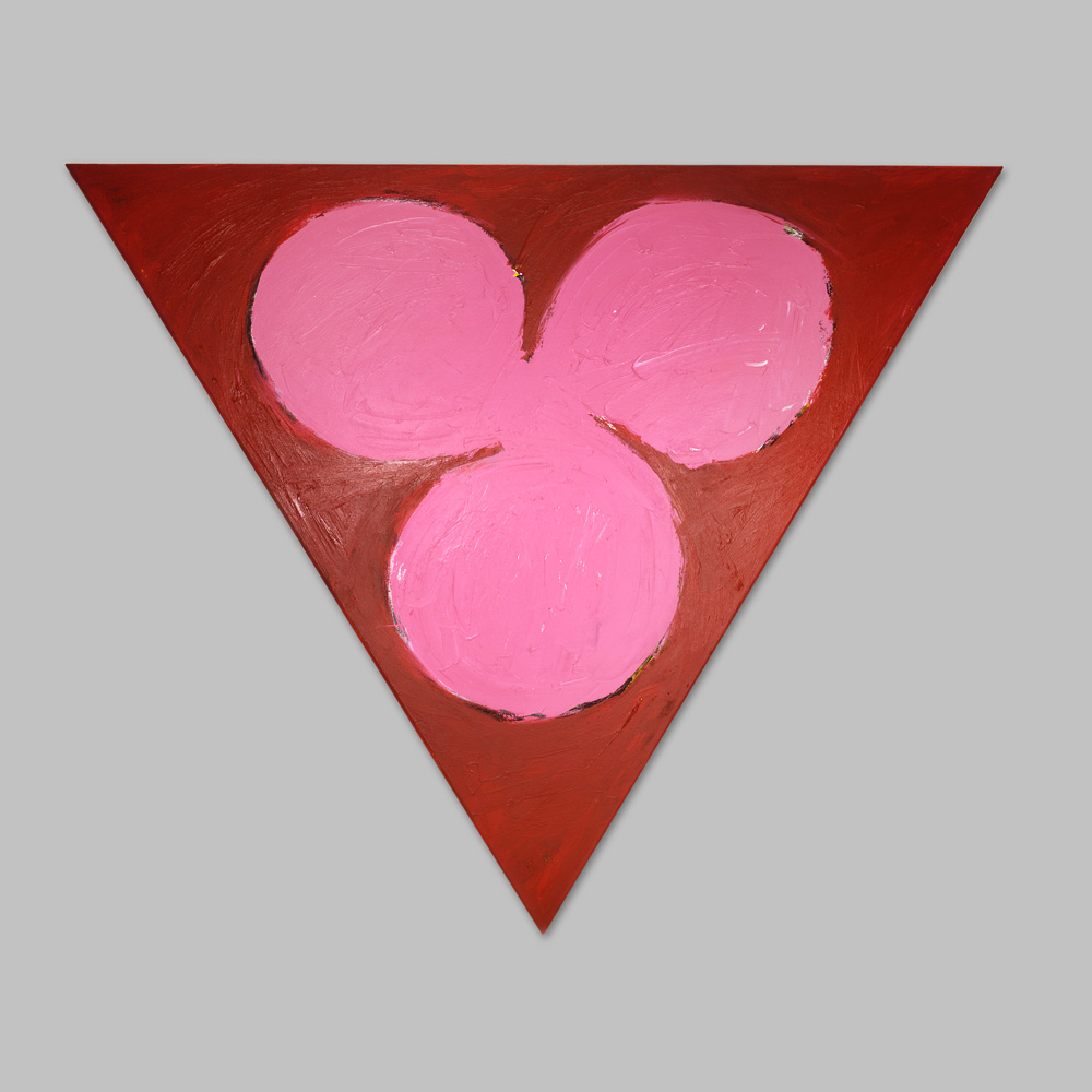
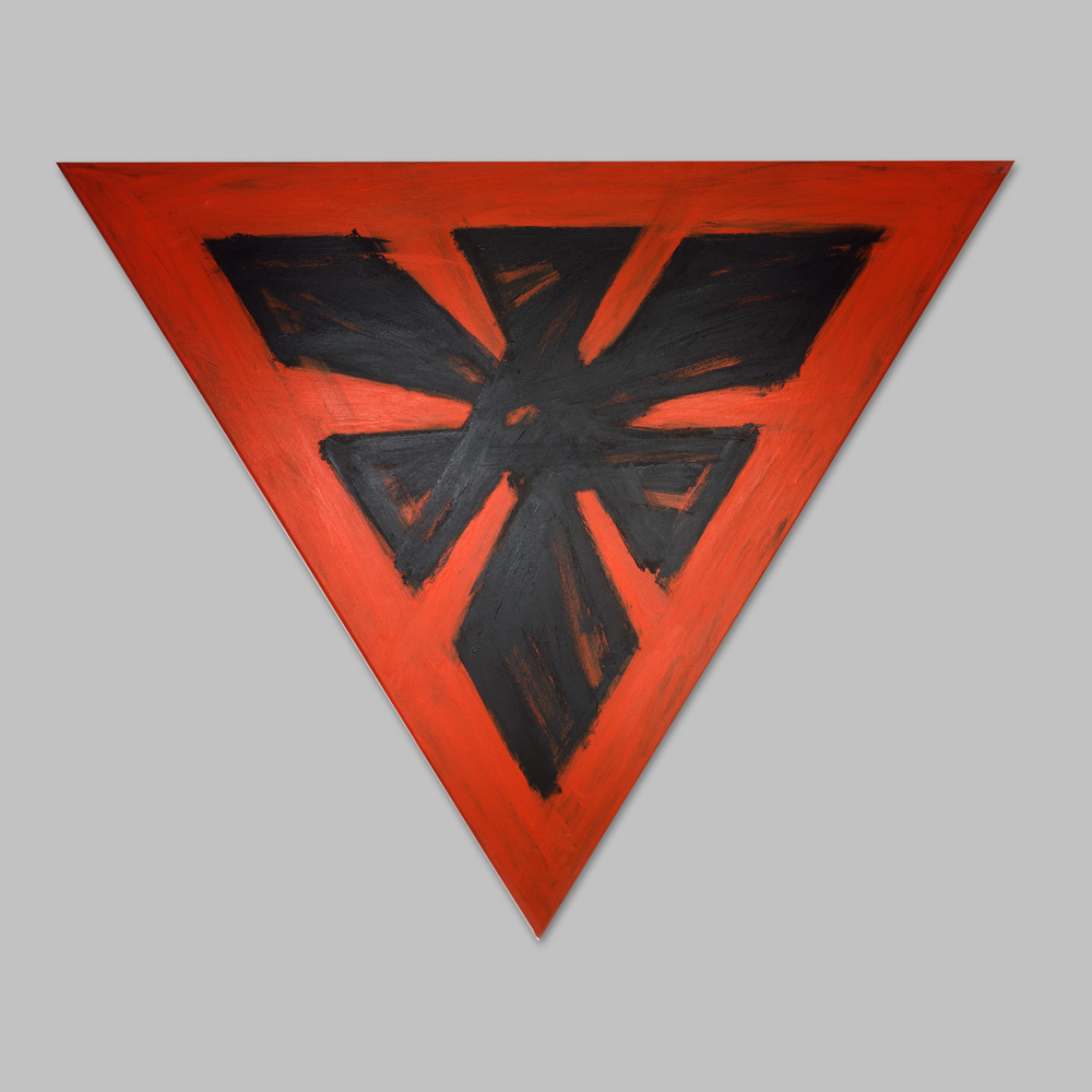
Within these triangular canvases, tripartite iconic forms predominate. The shapes have their origins in sketchbook doodles and gesture studies. Once Bob discovers a form that intrigues him, he reexamines it in oil stick and then, possibly, with color variations. The forms with which he has been working of late are distinguished by their different series – for example, Venus, Icon, or Post-Atomic. Though each series has distinctive characteristics, they are nevertheless very much interrelated by the metamorphosizing tripartite shape that is central to Bob’s iconography. The haunting landscape of Homage to A.P. Ryder (1995) or the Venus of Willendorf (1995) from the Venus series, morph from darker, primal eroticism into the over-the-top, slurpy Divine (1995) of the Icons. Divine’s soft pinkness finds its complementary counterpart in the lean and the athletic Icon entitled Triskellion (a.k.a. Michael) (1995) or the atavistic , somewhat menacing and medieval Heraldic Totem. Infinitely suggestive in its potential meanings, this tripartite form Bob employs is not limited to biomorphic interpretations. The Post-Atomic series of bomb-shelter-warning triangle trios is yet one more permutation within this alternative geometric universe Bob invokes.
Maintaining a tension between both sides of a thematic coin (masculine / feminine; organic / inorganic) is, indeed, a salient feature of Huot’s recent paintings (within individual works and from canvas to canvas). His Venus Racemic (1996) readily exemplifies this counterpoise. Using racemic crystals as his model (crystals occurring in mirror-image structures), Bob composed a mirror-image painting that juxtaposes his eroticized, biomorphic venus form with geometric triangles to create a careful balance between the sensual and the intellectual.² This juxtaposition suggests a myriad of essential dualities, such as ignorance and enlightenment and passivity and action.³ In Bob’s work, these poles should not be perceived as opposites, however, but are perhaps better understood as complementary halves, like the racemic crystal.
Stylistically, Bob is equally fluid in his ability to balance varied, seemingly contrary, means of expression. In three of his most recent paintings, Tallonfall, Ode to Ad, and Rottacon (all 1998) one can watch him pursue ideas through gestural brushwork, move to a Reinhardt-inflected geometry, and shift back again, parallel to the thematic juxtapositions noted above.
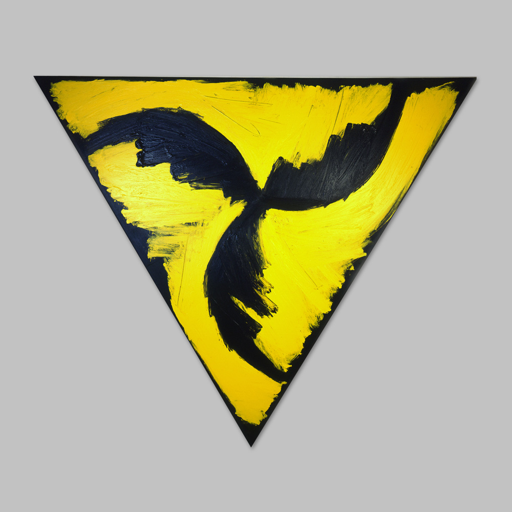
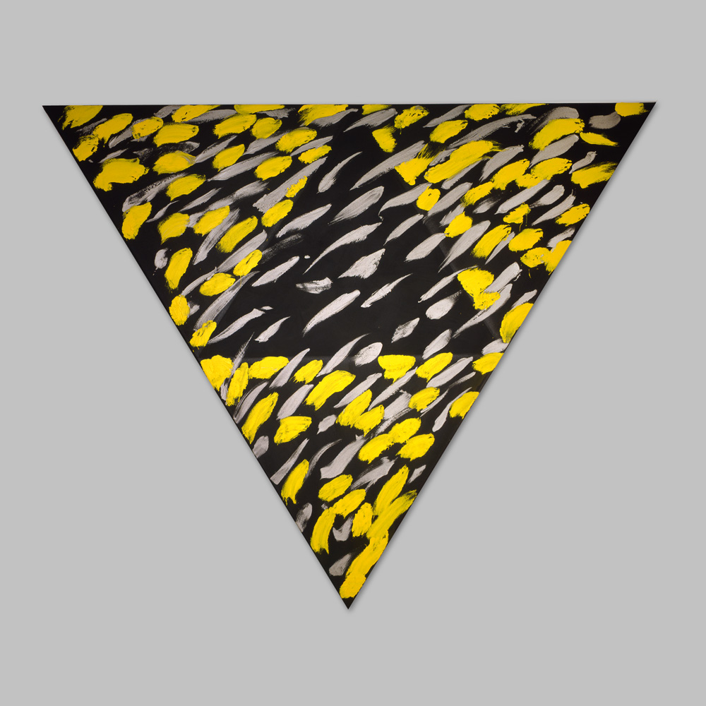
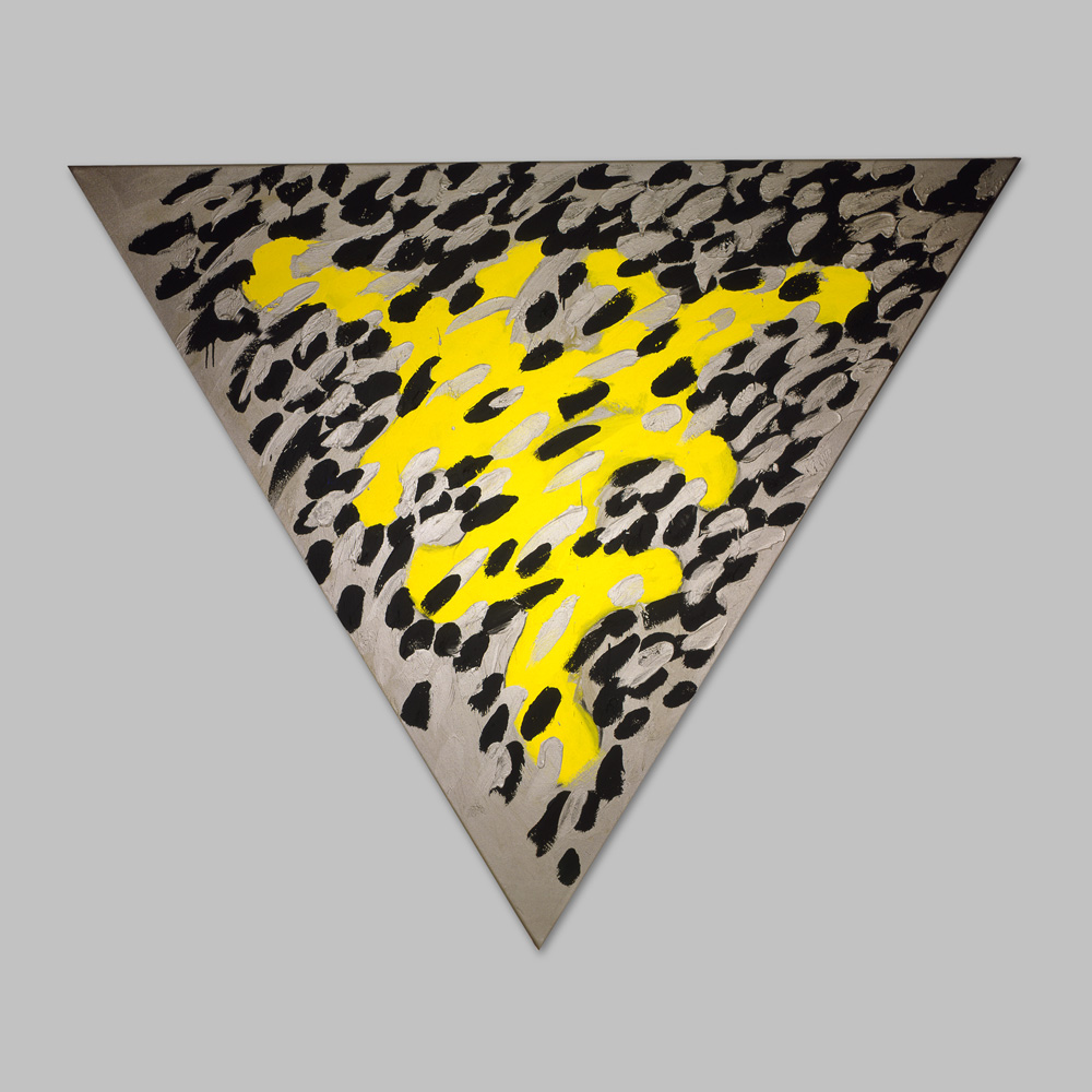
It is quite interesting, in fact, to analyze all of these recent works, to witness Bob through forty-odd years of experience, assemble the fundamental building blocks of painting so that form, color, surface finish, and pictorial space coalesce. The iconic Talonfall, for example, suggests a bird of prey in flight. Its three “wings,” however, merge with the painting’s Mars black border. The slightly glossy cadmium yellow, in turn, interacts aggressively with the black while equally defining form, thereby dissolving and distinction between figure and ground.4 Similarly, in Rattacon, the cadmium yellow light matte, stainless steel coarse, and carbon black matte paints are in constant movement across the surface of the canvas so that the acidic yellow, deKooningesque Woman form is constantly checked and matched by the other two tones.
As with every other aspect of his painting, Huot’s manipulation of color is a test of limits. To preface a description of his approach to color, Huot tells a story about the origins of his interest in “object color.” When he was a young boy, his father gave him old house paint and brushes and Bob painted all his toys – trucks, helmets, shield, airplanes, and so on. He notes that even as a child he was aware that each object
needed to be just the right color, and he repainted the truck or drum if he felt the first color was not quite correct. As a mature painter, Bob still prefers bold, straight hues and seeks to retain the fundamental character of those he uses.5 He has little interest in Albersian, relational resonance, nor does he use attractive color solely for its visual appeal. Instead, as in Talonfall, he employs contrasting colors to see how far they can be pushed and still retain their individual integrity. This is particularly notable in the radioactive palette of the Post-Atomic canvases but can be found, more subtly, in works such as Ferguson’s Ghost (1995).6 Here Bob plays cadmium red against stainless steel, but maintains chromatic balance and reins in the projecting red, by proportionally controlling the overlay of black gestural markings.
Ferguson’s Ghost provides a useful example as well for examining how Bob navigates through a composition’s space. Here he sought to create a painting and a color space within a plane that has limited dimension. His musings about Ghost led Bob to these questions: “Can I make a painting that is primarily two-dimensional and still plays with space? How can a thing be superimposed but not suggest three dimensions?” Such reflections evoke the image of a scientist proposing a hypothesis for experimentation, a valid paradigm for Bob Huot’s relationship to his work. In addition, this is wedded to a drive of sheer exuberance for painting.
With sustained admiration for artistic forebears Bradley Walker Tomlin (especially the late work), Stuart Davis, Marsden Hartley, and Franz Kline, Bob Huot understands where his efforts stand within the continuum of modernist practice. And after more than forty years, he knows, too, how to make a “good” painting, but that’s not what he typically sets out to do. Instead, Bob strives to push himself and the work beyond his expectations of merely being good to a virtual scientific examination of shape, color, space, and a subsequent, alchemical transformation of these formal components into something that packs an emotional and intellectual wallop.
Mary E. Murray
Curator of 20th –Century Art
Munson-Williams-Proctor
Institute Museum of Art
Utica, New York
August 1998
© Mary E. Murray
1 See Lucy Lippard, Six Years (New York: Praeger Publishers, Inc., 1973).
2 Similarly, R O Y (Homage to Hofmann), 1997, is a triptych of triangular canvases each with a warm, rich, umber ground and a lushly painted square of red, orange, or yellow. Huot finds the notion of squares within triangles a little outrageous in the first place, but typically for him, once he made the decision he did it in a big way, with lots of bravado brushwork. For all its painterliness and color, the triptych cannot of course escape its inherent geometry and there are several marks of measurements noticeably visible under each square that determine its size and placement. These marks are, in fact, places in the physical center of each triangle; the bottom of each square rests on the vertical center of the triangle, which creates the effect of an optical illusion.
3 As such, they are reminiscent of the “absolutes” to which Jack Flam referred in describing Robert Motherwell’s work in Robert Motherwell (New York and Buffalo: Abbeville Press, 1983), 27.
4 In fact, Bob dismisses such a distinction, believing that the painting is all one entity.
5 Although mixing reduces a color’s intensity and diminishes its true nature, Huot admits he has been known to tone a pigment up or down – if it’s the right thing to do for a painting.
6 One of a dozen or so paintings Huot created that were conceived as “skins,” canvases not intended to be stretched.